This is my redesign of the energy.gov homepage.
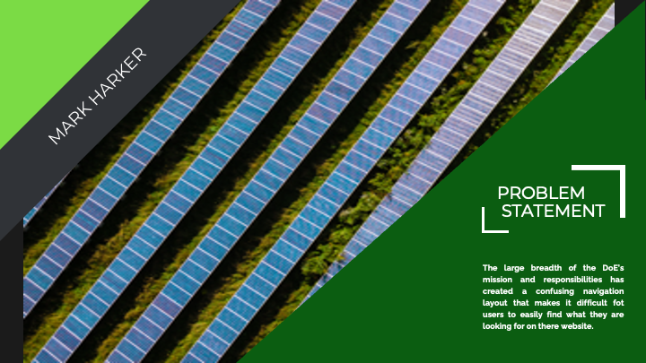
The energy.gov redesign project involved improving the usability and user experience of the U.S. Department of Energy's website. The goal of the project was to simplify the navigation and improve the overall design of the site, making it easier for users to find the information they need.
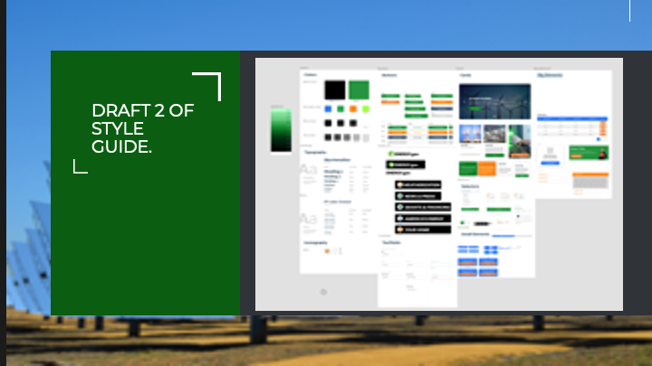
User testing indicated that the existing navigation flow was confusing, so I decided to simplify the navigation into four main sections: America's Energy, Your Home, News and Press Releases, and Grants and Fundraising. Each section contained information that was relevant and useful to users, such as information about the energy grid, energy-saving tips for homeowners, and information on how to apply for tax credits and energy-saving programs.
To improve the site's design, I turned the chaotic front page into an orderly slideshow that highlighted key information and featured images related to the Department of Energy's work. The redesigned footer was also included to better orient users and provide links to backend software portals that are relevant to the site's users.
Overall, the energy.gov redesign project succeeded in simplifying the site's navigation and improving its design, resulting in a better user experience for visitors. The site's new structure and design made it easier for users to find the information they need, while the inclusion of useful links in the footer helped to improve the site's overall functionality.


